What we do for
Rutherglen Tennis Club
Brand development
Serving up an ace project.
Scottish tennis is going through a bit of a rennaissance thanks in no small part to the efforts of the Murrays. The profile they’ve brought to the game has also seen a rise in participation and investment at a local level with community clubs benefitting from grass roots funding as never before.
The increased interest in the sport led Rutherglen Lawn Tennis Club to launch an ambitious campaign to acquire and revitalise the courts at nearby Burnside. As part of the redevelopment and to reflect the high standard of their new facilities the Club also wanted to give their existing logo a bit of a facelift. The new courts were officially opened in 2017 by Judy Murray and we’re delighted to have played a part.
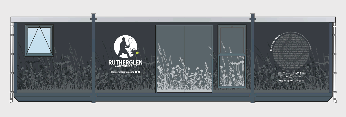
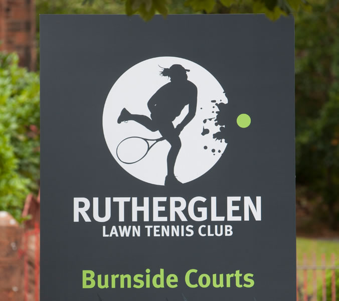
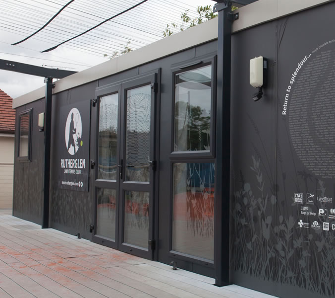
We reworked the old tennis player logo creating a total of four icons representing the mens, womens, junior and disabled membership. The tennis ball in familiar green/yellow smashes the boundary and adds a dynamic element to each of the logos. The new logo is created in white so that it can be applied to almost any background colour, clothing signage etc. and still retain its integrity. In addition to the branding we also did a full wrap of the clubhouse unit and designed signage around the site.
